This is one of the simplest and most interesting graphs in the silly app. It shows a high level view of when you sleep.
The graph's area is made up of every waking minute (vertical) of each day (horizontal) and bars are drawn at appropriate locations on the graph to indicate when you were asleep (green) and trying to sleep (blue). That's pretty much all there is to it.
Consider the following example:
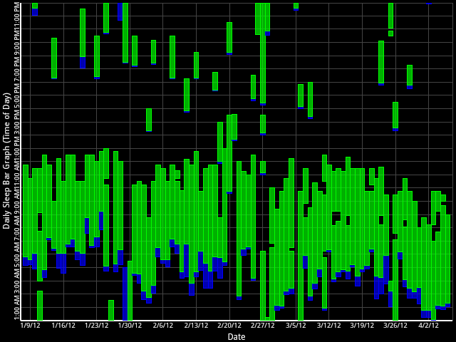
If these were the sleep habits of a real person, that person might need to seek professional help. Some things you may notice by looking at that graph include:
- The person does not go to sleep at a consistent bedtime nor wake up at a consistent time.
- The person seems to not go to sleep at all some nights.
- On the night of 1/28/12 (into 1/29/12), the person tried to sleep for hours and then gave up.
- The person damn near slept all day on 2/27/12.
- The person takes frequent naps in the afternoons.
- Long sleep periods suffer disruptions somewhat frequently (as evidenced by the breaks between bars indicative of holes).
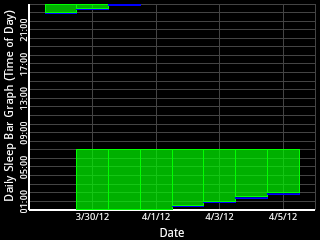 Some trends may become obvious when looking at this graph. The above graph is seemingly random, but consider the contrived example at right. It clearly shows that although the wakeup time is constant perhaps due to work or other obligation, the bedtime is drifting later which results in less sleep so that person might consider going to bed earlier.
In general, it's probably best to strive to make this graph look as close to a solid green box as possible indicating that you sleep a consistent pattern.