This graph isn't very useful. It is mostly for amusement.
The graph shows how your credit/debit score evolves over time where points above the red line indicate a credit and points below the red line indicate a debt. Because of the nature of the credit/debit score, this graph is perhaps most useful for short time periods, but it can be amusing to look at how terrible you've slept over a long period.
The content of this graph is similar to that of many others. The big dark semitransparent green box is the standard deviation, the dashed dark green line through the middle of the standard deviation is the mean, the bright green line without the ups and downs is the trend, and the red line identifies the 0:00 credit score. The bright green sawtooth looking thing is the actual credit score over time. Here's an example with the trend line turned off: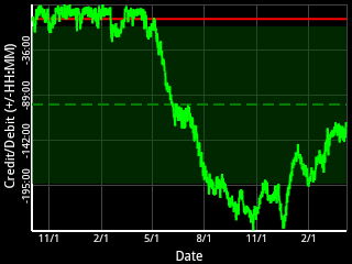
In a perfect world, our sleep would occur at regular intervals and our slumber would afford us the perfect amount of respite from our waking lives. This would make our credit/debit graphs look similar to this one: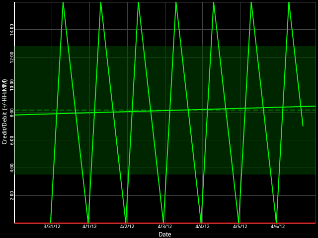
In the above graph, the credit score never goes into debt because as soon as the sleep credit reaches 0, the person went to sleep and got a perfect 8 hours of sleep every time and then was awake for 16 perfect hours before returning to sleep. It might be a noble goal to strive for a perfect graph like this one, but it's probably a fools errand because imperfect stuff happens in life.
The more likely scenario is a graph that looks more like this one here.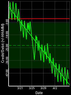
It starts off similar to the perfect one above and then all of a sudden, it goes off a cliff and never seems to recover. The reason for this inability to recover is that the credit/debit score can go infinitely negative so all those little times when an hour or two is missed here or there add up to this downward trend that doesn't go back up. After three weeks, this poor soul is in the hole about 58 hours.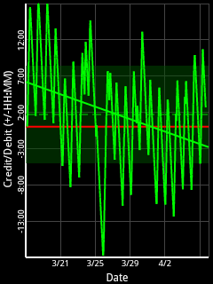
This kind of thing might be indicative of either not getting enough sleep or not needing as much sleep as is targeted. For example, that graph on the left there was created with an 8 hour target. Switching the target to 7 hours turns that same dataset and time period into the still screwed up but much more normal looking graph on the right.
So, try for a perfect graph but don't stress yourself out about it. If you fail miserably, don't be too alarmed. If your graph goes off a cliff, you might consider adjusting your sleep target. That's about it for this silly graph.