These graphs show the effect of aids, hindrances, or tags on sleep duration and time to fall asleep. A control group consisting of sleep periods that haven't been labeled with any items in a particular set (aids, hindrances, or tags) forms the baseline values for the graph. The appropriate means for each aid/tag/hindrance are compared to that of the control group and the results are displayed in bar graph format.
The example below shows an Aid Effectiveness Bar Graph but the concepts are the same for the hindrance and tag effect graphs also. The graph shows the effects of 3 aids (exercise, reading, and ear plugs) compared to the unaided control group. This graph shows that 2 of the 3 aids are effective at increasing nightly sleep duration and all 3 are pretty good at decreasing time to fall asleep. Ear plugs has the greatest positive effect on the nightly sleep duration of this particular dataset. The graph also shows that reading, which has a minimal effect on nightly sleep duration, has a significant positive effect on reducing time to fall asleep. It is also important to note that the sample size for all the aids in this example is very small compared to the sample size of the control group. With such small sample sizes, one should not rush to draw conclusions.
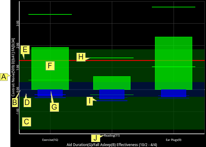
Control: None(509) D[6:41] FA[0:34]
The label of the time axis (Y axis shown above) displays information about the control group. In this case, the control group consists of all sleep periods that don't have any aids associated with them which is what the "None" part of the label is supposed to tell you. The "(509)" part says that 509 such sleep periods are in the control group. "D[6:41]" indicates a duration mean of 6 hours and 41 minutes for the control group and "FA[0:34]" indicates a time to fall asleep mean of 34 minutes for the control group.
0:00
The zero value on the graph represents the duration mean and time to fall asleep mean of the control group. Positive values on the time axis indicate a positive deviation from the control group whereas negative values indicate a negative deviation from the control group.
Control Duration Standard Deviation
The dark semitransparent green box shows the standard deviation of the duration of the control group. This box is important because it shows the variability of the durations in the control group. In order for the results for a particular aid to be considered statistically significant, they should fall somewhere outside of this box because those that fall within the box can be attributed to random variability of the data.
Control Time to Fall Asleep Standard Deviation
The dark semitransparent blue box shows the standard deviation of the time to fall asleep of the control group. This box is important because it shows the variability of the amount of time it takes to fall asleep in the control group. In order for the results for a particular aid to be considered statistically significant, they should fall somewhere outside of this box because those that fall within the box can be attributed to random variability of the data.
Target Duration
The red line shows the daily sleep target as configured in the app settings. In this case it is above the 0:00 line which means the duration mean of the control group is below the daily sleep target.
Duration Mean Difference from Control
There is one green bar for each aid and it shows how the duration mean for that aid relates to the duration mean of the control group. Positive values indicate that sleep duration increased when using the aid while negative values indicate that sleep duration decreased when using the aid. Aids with bigger positive green bars have bigger influences on nightly sleep duration.
Time to Fall Asleep Mean Difference from Control
There is one blue bar for each aid and it shows how the time to fall asleep mean for that aid relates to the time to fall asleep mean of the control group. Positive values indicate that it took longer to fall asleep when using the aid while negative values indicate that it took less time to fall asleep when using the aid. Aids with bigger negative blue bars are more effective at reducing the time it takes to fall asleep.
Duration Mean Standard Deviation
Two elongated lines show the standard deviation of the duration mean for each aid. Bigger distance between these lines indicates more variability in the dataset while smaller distance between the lines indicates more consistent results.
Time to Fall Asleep Standard Deviation
Two elongated lines show the standard deviation of the time to fall asleep mean for each aid. Bigger distance between these lines indicates more variability in the dataset while smaller distance between the lines indicates more consistent results.
Reading(11)
The labels of the aid/hindrance/tag axis show the name of the applicable aid/hindrance/tag followed by the sample size in parenthesis. Here, reading is the aid and there are 11 samples.